

Key Takeaways
Master architecture's alphabet before you chase meaning in buildings
Architecture is a language. Ching's core argument is that just as you must learn letters before words, grammar before sentences, and composition before writing a novel, a designer must learn the elemental vocabulary of form and space before tackling the deeper question of meaning. The depth of your design vocabulary shapes both how you see a problem and the range of solutions you can imagine.
A limited vocabulary limits solutions. The book quotes poet Piet Hein: shaping the question is part of the answer. Ching deliberately juxtaposes buildings across centuries and cultures (a Japanese shrine beside a Le Corbusier villa) to force you to spot the shared underlying grammar beneath radically different styles. The elements are timeless; the styles are just accents.
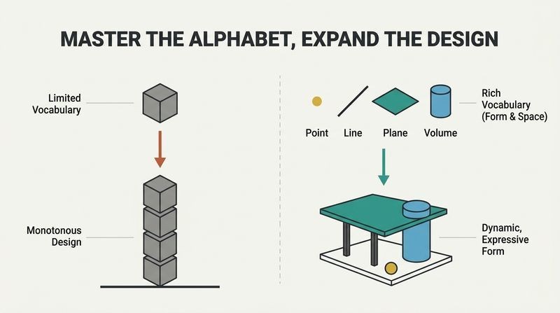
What's striking is how Ching frames creativity as constrained by literacy rather than talent. This echoes research in cognitive science on chunking: chess masters see board patterns, not individual pieces, because they possess a richer vocabulary of configurations. The same holds for jazz musicians and writers. The claim has a limitation worth naming: fluency in grammar does not guarantee poetry. Plenty of technically literate buildings feel dead. Ching concedes meaning lies beyond his scope, which is honest, but readers should treat this vocabulary as necessary, not sufficient, for architecture that moves people.
A point becomes a line, a line a plane, a plane a volume
Form grows dimensionally. Ching builds his entire system from four primary elements in sequence. A point marks position with no dimension. Set it in motion and it becomes a line (length). Extend a line sideways and it becomes a plane (length and width). Extend a plane and it becomes a volume (length, width, depth). These exist first as conceptual elements the mind senses, then as visible form with substance, color, and texture.
Each element plays architectural roles. A point projected upward becomes a column, obelisk, or tower (think the equestrian statue anchoring Michelangelo's Piazza del Campidoglio). Two points establish an axis. A row of columns reads as a line, then hardens into an implied plane, then a real wall. Planes define the ground, walls, and roofs that enclose every room you have ever stood in.
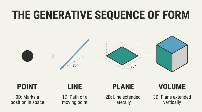
This developmental logic borrows directly from painter Paul Klee, whom Ching quotes, and from Bauhaus pedagogy where Klee and Kandinsky taught. It is elegant because it is generative: complex buildings decompose into these four moves. A useful cross-connection is to typography and graphic design, which use the identical point-line-plane vocabulary, suggesting a deep grammar shared across all visual arts. One caveat: the neat progression can imply buildings are assembled additively from abstractions, when in practice structure, gravity, and material often drive form first. The abstraction is a lens, not a construction sequence.
Buildings are equal parts solid mass and the void they carve
Form and space are one reality. Ching calls this the unity of opposites. Solid form (mass) and empty space cannot exist without each other, like figure and ground in a drawing, or the two-faces-or-a-vase optical illusion. He invokes Lao-tzu: a room's usefulness comes from the emptiness walls enclose, not the walls themselves.
The figure-ground flip. Giambattista Nolli's 1748 map of Rome shows this vividly: in some quarters buildings read as solid figures shaping street voids, while in others public squares and church interiors read as positive shapes against a background of building mass. Designers must care as much about the space around and between buildings as the buildings themselves. A structure can define a courtyard, stand as an object in a field, embed in landscape, or become landscape.
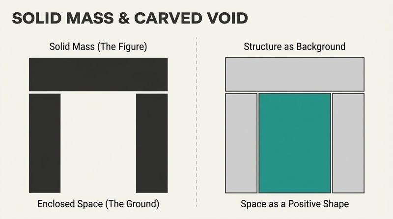
The Nolli map remains a staple of urban design studios precisely because it trains the eye to see void as substance. This reframing anticipates modern placemaking and the work of theorists like Jan Gehl, who argue cities fail when designers obsess over object-buildings and neglect the spaces between them. Gestalt psychology underpins the whole idea: perception organizes fields into figure and ground automatically. The deeper provocation is philosophical, echoing Taoist thought that utility resides in emptiness. It quietly critiques a Western, object-centric design culture that photographs buildings as sculptures while ignoring the lived experience of the spaces they frame.
Control enclosure and you control how a space makes people feel
Planes sculpt space by degree. Ching catalogs how horizontal and vertical elements define space with increasing force. A base plane (a rug, a terrace) merely suggests a zone. Elevate it and you honor it; depress it and you shelter it. An overhead plane defines volume like a tree's canopy. Vertical planes are more powerful still: a single wall fronts space, an L-shape captures a corner, parallels create a directional corridor, a U-shape opens one end, and four planes fully enclose.
Wall height is the hidden dial. A knee-high plane marks an edge without blocking view; at waist height it begins enclosing; at eye level it separates; above your head it fully divides and encloses. The Farnsworth House floats on an elevated plane; Greek amphitheaters exploit depressed ground for sightlines and acoustics.
This is arguably the book's most practically useful section, translating abstract geometry into felt experience. It aligns with environmental psychology research on prospect and refuge, the human preference for spaces offering both outlook and shelter, which explains why alcoves, bay windows, and lowered ceilings feel cozy. The ceiling-height insight connects to studies on the so-called cathedral effect, where high ceilings promote abstract, expansive thinking and low ceilings promote focused, detail-oriented work. Ching gives designers a vocabulary of graduated enclosure that maps neatly onto emotional intent, though he treats these responses as somewhat universal when culture and body size clearly modulate them.
Every building is a primary solid, transformed by adding or subtracting
Start with pure geometry. Ching argues our minds crave simple, regular shapes (Gestalt again), so the sphere, cylinder, cone, pyramid, and cube are the most stable, memorable forms. Le Corbusier called these the most beautiful forms because light reveals them without ambiguity.
Then transform them three ways.
1. Dimensional: stretch or compress (a cube becomes a slab or column).
2. Subtractive: carve a portion away (the mind still completes the whole, as with a notched cube).
3. Additive: attach subordinate forms.
Additive groupings cluster into five families: centralized, linear, radial, clustered, and grid. A form keeps its identity as long as subtraction does not destroy its edges and corners. Petra's Khasneh is carved from rock; Gwathmey's residence reads as sculpted primary solids.
The insight that we perceive mutilated forms as complete wholes is well grounded in Gestalt principles of closure and good continuation, the same mechanism that lets us read a logo with a missing chunk. Ching's transformation taxonomy is a powerful generative tool, essentially a design grammar of operations, and it prefigures parametric and computational design, where architects define a base form and a rule set of manipulations. A gentle critique: the primacy of Platonic solids reflects a particular modernist aesthetic. Vernacular and organic traditions, from Gaudi to contemporary blob architecture, thrive precisely by rejecting the tyranny of the pure prism.
Five ways to arrange rooms, each with a distinct personality
Organizations have temperaments. Ching identifies five patterns for arranging a building's spaces, each suited to different programs and sites:
1. Centralized: secondary spaces cluster around a dominant core (the Pantheon), stable and introverted.
2. Linear: a sequence of spaces expressing direction and movement, endlessly adaptable to terrain.
3. Radial: a central hub with linear arms reaching outward, extroverted (a pinwheel plan).
4. Clustered: spaces grouped by proximity and shared traits, flexible and additive (hill towns, pueblos).
5. Grid: spaces regulated by a three-dimensional modular field of columns and beams.
Form follows the program's hierarchy. The choice depends on functional adjacencies, which spaces deserve emphasis, and how the site constrains growth. A grid, like the column skeleton behind Le Corbusier's free plan, lets interior walls float independently of structure.
These five archetypes function like design patterns in software engineering, reusable solutions to recurring problems, and their power is diagnostic as much as generative. Faced with any plan, an architect can ask which organization governs it and why. The scheme's durability shows in how cleanly it maps onto building types: courtyard schools tend centralized, hospitals linear or grid, airports radial. One limitation is that real buildings are usually hybrids, and Ching acknowledges this. The taxonomy risks encouraging students to force messy programs into tidy categories rather than letting genuinely mixed conditions produce genuinely mixed forms. Still, as a starting analytical framework it is remarkably robust.
Two rooms relate in only four fundamental ways
The grammar of adjacency. Beyond whole-building organizations, Ching isolates how any two spaces connect:
1. Space within a space: a large volume envelops a smaller one, which depends on the larger for its link to the outside (a glass pavilion around an inner room).
2. Interlocking spaces: two volumes overlap, sharing a zone that either merges with one or becomes its own linking space.
3. Adjacent spaces: the most common relationship, where a shared plane both separates and binds (its permeability, from solid wall to a row of columns to a mere floor-level change, sets the degree of continuity).
4. Spaces linked by a common space: two distant rooms joined by an intermediary that can differ in form to express its connecting role.
These four moves are the joints of every floor plan.
This granular vocabulary complements the five organizations by zooming in from the building to the room-to-room seam. The concept of the shared plane as a dial of continuity is especially useful, connecting to Christopher Alexander's pattern language and its concern with thresholds and transitions. The idea that a dividing element can be as slight as a change in level or material anticipates open-plan living and the modern dissolution of interior walls. What Ching captures that many designers miss is that separation and connection are not opposites but a spectrum. The same plane does both jobs simultaneously, and calibrating it is a core design act.
You experience a building through movement, so choreograph the path
Circulation is the perceptual thread. Because you move through spaces in sequence over time, you experience each room in relation to where you have been and where you expect to go. Ching breaks the journey into components: the approach (frontal, oblique, or spiral), the entrance (flush, projected, or recessed), and the path configuration (linear, radial, spiral, grid, network, or composite).
The approach primes perception. A frontal, axial approach announces the destination directly. An oblique one prolongs anticipation and reveals a building in perspective. A spiral, like the winding ascent to the Acropolis where the Parthenon is glimpsed in fragments, dramatizes three-dimensional form. Crossing a threshold means penetrating a plane that separates here from there. Even a subtle shift in level can mark that passage. Stairs add a temporal, three-dimensional dimension to arrival.
Ching draws on Charles Moore's body-centered theory of architecture, insisting design is not just an abstract visual art but a haptic, kinesthetic one. This resonates strongly with contemporary embodied cognition research, which holds that thought and perception are grounded in bodily experience, not disembodied vision. The Acropolis example is a classic of the picturesque, asymmetrical siting championed by Camillo Sitte, who argued that the surprise of a partially glimpsed monument creates more delight than a static axial reveal. The insight generalizes beyond buildings: theme park designers, filmmakers, and museum curators all choreograph movement to control revelation and pacing. Architecture, in this view, is closer to cinema than to sculpture.
Proportion systems tie every part to the whole through one ratio
Order through shared ratios. A proportioning system establishes a consistent visual relationship among a building's parts and between the parts and the whole, so everything belongs to the same family. Ching surveys the historical attempts:
1. The Golden Section (roughly 0.618), where the smaller part relates to the larger as the larger relates to the whole, echoed in the Fibonacci series and the Parthenon's facade.
2. The Classical Orders, where the column diameter becomes the module governing every dimension.
3. Renaissance theories linking architectural ratios to musical harmony (Palladio's rooms use 3:4, 4:4, 4:6).
4. Le Corbusier's Modulor, fusing the Golden Section with human body measurements.
5. The Japanese ken, a column-spacing module that ordered structure, tatami mats, and even ceiling heights.
The recurring dream across these systems is Pythagorean: that number governs beauty and mirrors cosmic harmony. Modern empirical aesthetics has largely failed to confirm any special human preference for the Golden Ratio, and Ching himself concedes that observers cannot consciously perceive precise proportions. So why do these systems persist? Their real value may be pragmatic rather than mystical: they impose internal consistency and spare the designer from arbitrary, capricious dimensioning. Le Corbusier called the regulating line an assurance against caprice, a means of verification, not a recipe. Viewed this way, proportion systems are less about unlocking cosmic beauty than about disciplining thousands of small decisions toward coherence.
Human scale means a doorway you can touch and a ceiling you can sense
Scale is relational, always a comparison. Ching distinguishes proportion (internal mathematical relationships) from scale (how big something looks relative to something else). Visual scale judges an element against its context; a single oversized window rescales an entire facade. Human scale grounds size in the body: a space you can span by reaching out, a ceiling you can nearly touch.
Familiar elements are the yardstick. Doorways, stair treads, railings, and window sills carry known dimensions, so we read building size through them. The University of Virginia library and Reims Cathedral operate at two scales at once: a monumental scale legible from afar and a human-scaled door within it, sized to a single person. Of a room's three dimensions, ceiling height most affects its felt scale. Raising a 12-by-16 room's ceiling one foot registers more than widening it.
The dual-scale insight, monumental and human operating simultaneously, is a sophisticated observation that explains why grand civic buildings can feel both awe-inspiring and welcoming. It connects to Robert Venturi's celebration of complexity and contradiction, the idea that great architecture holds multiple readings at once. Ching's emphasis on the doorway as a universal unit of measure is quietly profound: it means the human body is permanently embedded in how we read the built world, a point ergonomics and anthropometrics formalize. The ceiling-height claim is testable and largely supported by spatial perception research, reminding designers that the cheapest lever for changing a room's character is often vertical, not horizontal.
Six ordering principles let variety and unity coexist without chaos
Unity with variety is the goal. Order without diversity is monotonous; diversity without order is chaos. Ching offers six visual devices that let diverse forms cohere:
1. Axis: a line between two points organizing elements symmetrically or in balance.
2. Symmetry: balanced arrangement across a line (bilateral) or around a center (radial).
3. Hierarchy: making one space dominant through exceptional size, unique shape, or strategic placement.
4. Datum: a line, plane, or volume whose regularity gathers scattered elements (like the staff lines under musical notes).
5. Rhythm: patterned repetition of elements, from a steady colonnade to syncopated facades.
6. Transformation: taking a prototype and altering it through steps without losing its core identity.
Hierarchy deserves special emphasis: Ching warns that when everything is emphasized, nothing is, a principle as true in graphic design, writing, and public speaking as in architecture. The datum concept, illustrated with a musical staff, is the subtlest and most original of the six, naming the quiet background regularity that lets us read differences. Transformation is arguably the meta-principle of the entire book, since Ching presents all architecture as variations on primary solids and archetypal organizations. These principles are essentially perceptual heuristics rooted in Gestalt grouping laws. Their cross-disciplinary reach, from Bach's cello suites to Palladio's villas, suggests they describe how human attention organizes any complex field, not just buildings.
Analysis
Ching's Architecture: Form, Space, and Order is not a theory of architecture so much as a grammar of it. First published in 1979 and refined across four editions, it endures because it brackets the contentious questions of style, politics, and meaning to isolate something more durable: the elemental operations by which humans shape enclosure. Its method is comparative and deliberately ahistorical in juxtaposition, placing a Shinto shrine beside a Corbusian villa to reveal a shared syntax beneath divergent surfaces. This is the book's signature intellectual move and its greatest pedagogical gift.
The deep structure is a nested hierarchy. Primary elements (point, line, plane, volume) build into form, form defines space, spaces relate and organize, movement threads them together, and proportion, scale, and ordering principles regulate the whole. Each layer is a vocabulary; mastery accumulates. The genius lies in decomposition: any building, however complex, can be read back down through these layers, which makes the book as much an analytical instrument as a design manual.
Intellectually, Ching stands on Gestalt psychology (our drive to simplify perception into regular figures), on Bauhaus pedagogy via Klee, and on the body-centered phenomenology of Charles Moore. The through-line is that architecture is perceived, not merely constructed, and that perception follows knowable rules. This is the book's strength and its boundary. It excels at the visual and spatial while explicitly deferring semiotics, sustainability, economics, and social justice, dimensions that dominate contemporary discourse.
The fairest critique is that a grammar can produce correct sentences that say nothing. Ching knows this, ending on meaning as the horizon beyond his scope, quoting Le Corbusier on the moment construction becomes art. What the book guarantees is literacy, the precondition for eloquence. For students, it remains the most efficient path from seeing buildings to understanding them, which is why it has trained architects for over four decades.
Review Summary
Architecture: Form, Space and Order is widely regarded as an essential introductory text for architecture students and enthusiasts. Readers praise its clear explanations, beautiful hand-drawn illustrations, and comprehensive coverage of architectural principles. Many consider it a timeless reference that they return to throughout their careers. The book's focus on fundamental concepts and visual examples makes it accessible to beginners while still valuable for experienced professionals. Some criticisms include its brevity on certain topics and potential difficulty for non-architects to fully appreciate. Overall, reviewers highly recommend it for anyone interested in understanding architectural design.
People Also Read


FAQ
What's "Architecture: Form, Space, & Order" about?
- Comprehensive Guide: The book is a comprehensive guide to understanding the fundamental elements of architecture, focusing on form, space, and order.
- Design Vocabulary: It introduces a design vocabulary that is both elemental and timeless, essential for students and professionals in architecture.
- Historical and Contemporary Examples: The book includes historical models and contemporary examples to illustrate the principles discussed.
- Visual and Spatial Ideas: It emphasizes the visual and spatial ideas that are crucial in the shaping of our environment.
Why should I read "Architecture: Form, Space, & Order"?
- Foundational Knowledge: It provides foundational knowledge for anyone interested in architecture, from students to practicing architects.
- Visual Clarity: The book uses diagrams and illustrations to clarify complex architectural concepts.
- Timeless Principles: It discusses principles that are applicable across different architectural styles and periods.
- Practical Application: The book encourages readers to apply these principles to a range of architectural problems.
What are the key takeaways of "Architecture: Form, Space, & Order"?
- Primary Elements: Understanding the primary elements of form—point, line, plane, and volume—is crucial.
- Spatial Relationships: The book explores how spaces can be related and organized in architectural design.
- Proportion and Scale: It discusses the importance of proportion and scale in creating harmonious architectural compositions.
- Ordering Principles: The book outlines principles like axis, symmetry, and hierarchy that help organize architectural forms and spaces.
What are the best quotes from "Architecture: Form, Space, & Order" and what do they mean?
- Le Corbusier on Architecture: "Architecture is the masterly, correct and magnificent play of masses brought together in light." This quote emphasizes the importance of light in revealing architectural forms.
- Lao-tzu on Space: "We put thirty spokes together and call it a wheel; but it is on the space where there is nothing that the utility of the wheel depends." This highlights the significance of space in architecture.
- Edmund N. Bacon on Form: "Architectural form is the point of contact between mass and space." This underscores the relationship between physical structures and the spaces they define.
How does Francis D.K. Ching define "Primary Elements" in architecture?
- Conceptual Elements: Primary elements include point, line, plane, and volume, which are not visible but can be sensed.
- Visual Elements: When made visible, these elements become forms with characteristics like shape, size, and texture.
- Role in Design: They serve as the building blocks for more complex architectural forms and spaces.
- Growth from Point to Volume: The book explains the growth from a point to a one-dimensional line, to a two-dimensional plane, and finally to a three-dimensional volume.
What is the significance of "Form & Space" in architecture according to Francis D.K. Ching?
- Unity of Opposites: Form and space are interdependent, creating a unity of opposites in architectural design.
- Visual Field: Our perception of form and space depends on how we interpret the visual interaction between positive and negative elements.
- Architectural Order: The relationship between form and space is crucial for creating architectural order and meaning.
- Impact on Design: Understanding form and space helps architects design environments that are both functional and aesthetically pleasing.
How does "Architecture: Form, Space, & Order" explain "Proportion & Scale"?
- Relation to Human Body: Proportion and scale often relate to the dimensions and proportions of the human body.
- Mathematical Systems: The book discusses mathematical systems like the Golden Section and their application in architecture.
- Visual Perception: Our perception of proportion and scale is influenced by perspective, distance, and cultural biases.
- Design Decisions: Proportion and scale guide design decisions, affecting the harmony and balance of architectural compositions.
What are the "Ordering Principles" discussed in "Architecture: Form, Space, & Order"?
- Axis: A line established by two points, around which forms and spaces can be arranged.
- Symmetry: The balanced distribution of forms and spaces on opposite sides of a dividing line or plane.
- Hierarchy: The articulation of importance through size, shape, or placement of forms and spaces.
- Rhythm and Repetition: The patterned recurrence of elements to create a sense of movement and continuity.
How does Francis D.K. Ching address "Spatial Relationships" in architecture?
- Space Within a Space: A smaller space contained within a larger one, creating a sense of hierarchy.
- Interlocking Spaces: Overlapping spaces that share a zone, allowing for dynamic interactions.
- Adjacent Spaces: Spaces that abut each other, sharing a common border for continuity.
- Spaces Linked by a Common Space: Two spaces connected through an intermediary space, enhancing their relationship.
What role do "Circulation Elements" play in architectural design according to the book?
- Movement Through Space: Circulation elements guide the movement of people through a building.
- Approach and Entrance: The design of approaches and entrances sets the tone for the experience of the building.
- Path Configuration: The layout of paths influences the spatial organization and user experience.
- Form of Circulation Space: The design of corridors, halls, and stairways affects the flow and interaction within a building.
How does "Architecture: Form, Space, & Order" explore "Transformation of Form"?
- Dimensional Transformation: Altering one or more dimensions of a form while retaining its identity.
- Subtractive Transformation: Removing portions of a form to create new spatial relationships.
- Additive Transformation: Adding elements to a form to enhance its complexity and function.
- Design Flexibility: Transformation allows for adaptation to specific contexts and design challenges.
What is the importance of "Surface Articulation" in architectural design as per Francis D.K. Ching?
- Visual Perception: Surface articulation affects how we perceive the shape, size, and scale of a plane.
- Material and Texture: The choice of materials and textures influences the visual weight and character of a form.
- Pattern and Color: Patterns and colors can emphasize or de-emphasize certain elements, affecting the overall composition.
- Architectural Expression: Surface articulation contributes to the aesthetic and functional expression of a building.
Download PDF
Download EPUB
.epub digital book format is ideal for reading ebooks on phones, tablets, and e-readers.