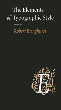
Key Takeaways
1. Typography Serves the Word, Not Itself
Typography with anything to say therefore aspires to a kind of statuesque transparency.
Content is King. Typography's fundamental purpose is to clarify, honor, and effectively share the meaning of a text, rather than drawing attention to its own aesthetic qualities. Like a skilled orator whose delivery enhances the message without overshadowing it, good typography strives for transparency, enabling the reader to fully immerse themselves in the content. Its ultimate goal is to achieve both legibility and an "earned or unearned interest" that imbues the page with living energy, whether for a simple business card or a profound sacred scripture.
Dignity of Letters. Each individual letterform possesses an inherent life and dignity, demanding careful selection and affectionate setting by the typographer. Typography is essentially idealized writing, transforming the raw, expressive energy of the handwritten word into a refined, ordered, and precisely replicable visual form. When executed with intelligence and skill, letters appear vibrant and dynamic on the page; conversely, poor design renders them stale and uninviting, ultimately shortchanging the reader's experience.
Style Beyond Style. True typographic style transcends any particular aesthetic, such as Neoclassical or Baroque, instead representing the mastery to navigate the entire domain of typography with grace and vitality. It functions as an essential act of interpretation, akin to a musical performance, revealing the text's intrinsic composition without ever replacing it. The typographer's highest calling is to elucidate and ennoble the text, avoiding superficial adornment or manipulative visual tricks.
2. The Invisible Dance: Mastering Typographic Rhythm
Good letterforms are designed to give a lively, even texture, but careless spacing of letters, lines and words can tear this fabric apart.
Fabric of Text. Typography weaves a "textus," a cloth of words, aiming for an even density or "color" on the page. This visual color depends on the intricate interplay of letter spacing, word spacing, and line spacing. Careless adjustments to these elements can severely tear this delicate fabric, making the text difficult to read and visually jarring. The ideal word space, for instance, is typically a quarter of an em, a flexible measure adjusted for factors like letterfit and the overall type color.
Horizontal Flow. Optimal line length is crucial for comfortable reading, with a range of 45 to 75 characters (including spaces) widely regarded as satisfactory for single-column text, and 66 characters often cited as ideal. Shorter lines, particularly in narrow columns, may necessitate ragged-right setting to prevent "white acne"—a distracting rash of erratic word spaces—or an epidemic of hyphenation. Consistency in spacing is paramount; a single word space after punctuation is the modern standard, a deliberate departure from outdated Victorian habits.
Vertical Harmony. Just as music meters time, typography meters vertical space through "leading," which is the precise distance from one baseline to the next. This leading must be carefully chosen to suit the typeface, the nature of the text, and the measure of the line. It should then be adjusted in measured intervals to maintain a consistent rhythm throughout the page. Intrusions like headings or block quotations should consume vertical space in exact multiples of the basic leading, ensuring the main text realigns perfectly on beat after each interruption.
3. Choosing Voices: The Art of Typeface Selection
Letterforms have tone, timbre, character, just as words and sentences do.
Type's Personality. Every typeface possesses a unique character, spirit, and personality, reflecting its designer's temperament, cultural background, and historical context. The typographer's crucial task is to select a face that harmonizes with the text's inherent tone, tempo, and logical structure. This involves discerning subtle features through years of dedicated study and comparison, ensuring the typeface acts as an appropriate "voice" for the written word, enhancing its message without imposing an alien aesthetic.
Family Dynamics. Typefaces often belong to extended families, offering a range of variations including roman, italic, small caps, and different weights (e.g., light, medium, bold, black). A well-chosen family provides both visual variety and underlying homogeneity, allowing for clear differentiation between textual elements without stylistic clashes. However, not all family members are equally useful; boldfaces, for instance, are a nineteenth-century invention and may not suit older designs or every context, sometimes disrupting historical integrity.
Beyond the Obvious. Selecting a typeface transcends superficial or pun-based associations. While a book on bicycle racing might tempt one to use a "Bicycle" font, the best choice is usually an inherently good, legible text face that is sympathetic to the theme without being overly literal or ornamental. The goal is to find a face that can furnish all necessary special effects—such as specific numerals, small caps, or matching non-Latin scripts—while maintaining its integrity and contributing to the overall design.
4. Silent Signals: The Eloquence of Punctuation and Symbols
The visible invisibility of the marks of punctuation, which is essential to their function, depends on these details.
Unsung Heroes. Beyond the alphabet's letters, typography meticulously handles a "herd of flicks, squiggles, dashes, dots and ideographs"—analphabetic symbols. These marks, ranging from periods and commas to dashes and ligatures, serve as crucial signs of logical pause, intonation, or stylized abbreviations. Their subtle design and precise placement are paramount for their "visible invisibility," allowing them to guide the reader's eye and comprehension without becoming distracting visual noise.
Symbolic Harmony. Analphabetic symbols and diacritics must be meticulously "in tune with the basic font," matching its weight, style, and proportions to maintain visual coherence. Poorly designed or carelessly borrowed symbols—such as square brackets, asterisks, or parentheses—can severely disrupt the page's overall harmony and legibility. Even seemingly simple characters like the hyphen possess a rich history of varied forms and widths, reflecting diverse calligraphic traditions and aesthetic preferences that should be respected.
Punctuation as Notation. Punctuation functions as "cold notation," a precise typographic code rather than an expressive outburst. It should be used minimally and consistently, contributing genuine information without over-emphasizing or cluttering the text. This includes judicious use of quotation marks, consistent positioning of punctuation relative to quotes, and eliminating unnecessary marks like periods after metric units or hyphens in common compound words, while always preserving those essential for clarity and meaning.
5. Building the Stage: Page Layout and White Space
The page, the pamphlet or the book must be seen as a whole if it is to look like one.
Holistic Design. A well-designed page is a unified, coherent whole, an "antiphonal geometry" created by the interplay between the page's overall dimensions and the textblock's shape. This involves selecting inherently satisfying page proportions, often derived from natural geometry like the golden section or musical intervals, rather than relying on arbitrary or standard industrial sizes. The page's dimensions should thoughtfully suit the publication's content, size, and ambitions, evoking appropriate responses and expectations in the reader.
Textblock's Role. The textblock, metaphorically the "heart and mind" of the page, must balance and contrast harmoniously with the overall page shape. For continuous and fluent reading, columns should be clearly taller than wide, a visual cue that the typographer does not expect the reader to struggle with the words. Medieval and Renaissance typographers often employed differing proportions for page and textblock to create polyphonic visual chords, generating both energy and underlying harmony within the layout.
Margins and Satellites. Margins are not merely empty space; they are integral to the page's design, serving to lock the textblock to the page and frame it for optimal legibility and ease of handling. Typographic "satellites" such as folios (page numbers), running heads, and marginal notes should be meticulously designed to vitalize the page and guide the reader without becoming distracting elements. These features, whether recurrent or unpredictable, contribute significantly to the page's overall rhythm, poise, and functional beauty.
6. Echoes of Time: Typefaces as Historical Artifacts
Typography, like other arts, preys on its own past.
Living History. Roman type has evolved over five centuries, with its roots stretching back millennia to early Greek inscriptions and Carolingian minuscules. Understanding this rich history is crucial for intelligent typeface selection, as ancient forms continue to live and resonate within new designs. Typefaces carry inherent historical echoes and associations, and a good typographer seeks to set texts in faces and forms to which they "actually belong," thereby generating deeper insight and energy for the reader.
Evolution of Style. Typefaces, much like music or architecture, distinctly reflect their historical periods: Renaissance, Baroque, Neoclassical, Romantic, Modern, and Postmodern. Each era introduced unique characteristics:
- Renaissance: Sensuous, humanist axis, modest contrast (e.g., Jenson, Griffo).
- Baroque: Restless, dramatic, variable axis, increased contrast (e.g., Van Dijck, Kis).
- Neoclassical: Static, restrained, vertical axis, refined serifs (e.g., Baskerville, Didot).
- Romantic: Exaggerated contrast, intensified vertical axis (e.g., Bodoni, Walbaum).
Modern Interpretations. The 20th century saw the emergence of Realist (slab serifs, uniform stroke), Geometric Modernist (pure geometry), and Lyrical Modernist (rediscovery of humanist forms) types. Postmodernism often recycles and revises earlier forms with self-conscious humor and irony. When employing historical typefaces, it is essential to learn the typographic idiom for which they were intended, including appropriate page proportions and the historical absence of boldface in earlier periods.
7. The Digital Craft: Honing Fonts for Modern Reading
The state of the art has more by far to do with the knowledge and skill of its practitioners than with the subtleties of their tools, but tools can constrain that skill or set it free.
Tools and Skill. While digital tools offer immense capabilities, the ultimate quality of typography remains profoundly dependent on the typographer's knowledge and skill. The transition from three-dimensional metal type to two-dimensional digital and offset printing has introduced new challenges and opportunities, requiring meticulous attention to how typefaces, originally designed for tactile impressions, translate to flat surfaces and screen displays. Choosing fonts faithful to the spirit of old designs and optimized for final printing conditions is paramount.
Grooming the Font. Digital fonts, much like musical instruments, require careful tuning and maintenance. This involves refining lettershapes, character sets, spacing, and kerning tables to ensure optimal performance. Many commercially available fonts, even those based on excellent designs, may contain "alien or sloppy supplementary characters" or inadequate kerning. A dedicated typographer will "fix it once and for all" by editing the font itself, ensuring consistent quality and legibility across all uses and contexts.
Digital Refinements. Modern justification engines can achieve microscopic adjustments to spacing within and between letters, far beyond what was possible with traditional metal type. This capability is crucial for creating a page of truly even color and texture. However, screen reading presents distinct challenges, often demanding low-contrast, large-torso, open-counter faces for legibility. The typographer must skillfully bridge the gap between cottage-scale design and heavy-industry printing, ensuring the final product honors both the text and the enduring craft.
8. Global Voices: Designing for Diverse Alphabets
Typography and typographers must honor the variety and complexity of human language, thought and identity, instead of homogenizing or hiding it.
Beyond Latin. The Latin alphabet, though globally dominant, represents just one among many rich writing systems. Arabic, Cyrillic, Greek, Hebrew, and numerous other scripts each possess their own intricate histories, traditions, and specific typographic requirements. A truly intelligent typographer embraces this "plurality of typographic history," recognizing that each alphabet embodies a unique culture deserving profound respect and careful consideration in design and application.
Multilingual Harmony. When mixing alphabets, whether Latin with Greek or Cyrillic, the primary objective is to achieve a close balance in visual color and contrast, thereby reflecting the underlying continuity of thought in the text. Random combinations appear ungainly and distracting; instead, designers should seek "homogeneous polyglot families" or meticulously matched faces that complement each other. Optical balance, rather than strict mathematical equivalence, is key, especially when considering factors like x-height and the unique breathing room required by different scripts.
Evolving Scripts. No writing system is static; many languages, either new to written form or still developing their literate conventions, require thoughtful and sensitive character design. This involves adding only visually distinct and genuinely necessary characters, while rigorously avoiding capricious redefinitions of familiar symbols. The advent of Unicode, with its capacity for hundreds of thousands of characters, facilitates this global typographic diplomacy, enabling the accurate and respectful representation of diverse linguistic identities across the world.
Last updated:
Review Summary
The Elements of Typographic Style is widely regarded as a comprehensive and essential guide to typography. Readers praise Bringhurst's expertise, engaging writing style, and the book's meticulous design. Many consider it a must-read for designers, typographers, and anyone interested in book design. The text covers historical context, practical guidelines, and philosophical insights into typography. While some find certain sections overly technical or prescriptive, most appreciate the depth of knowledge and passion conveyed. The book is credited with enhancing readers' appreciation for typographic details and influencing their approach to design.
Similar Books










Download PDF
Download EPUB
.epub digital book format is ideal for reading ebooks on phones, tablets, and e-readers.
