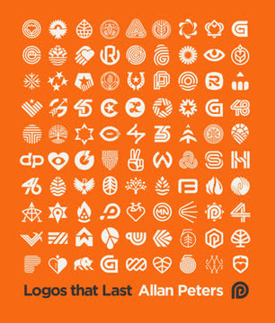
Key Takeaways
1. Passion and Hard Work Fuel Lasting Design
You need to bring those to the table if you want to succeed.
Passion is the engine. Allan Peters' journey, from a six-year-old drawing triangular spaceships to designing for billion-dollar brands, is fueled by an enduring love for art and design. This deep passion drives him to constantly improve, work long hours not out of obligation but dedication, and pursue perfection in every project. It's the essential ingredient that cannot be taught.
Dedication builds skill. Over two decades, Peters honed his craft by working in diverse environments – boutique studios, large marketing firms, global advertising agencies, and in-house for a top brand like Target. He studied how each tackled brand identity, absorbing lessons on color, culture, creative freedom, agency function, advertising, and corporate dynamics. This relentless pursuit of learning and application built the "unstoppable tank" work ethic necessary for success.
Love shows in the work. When a designer is truly passionate, that enthusiasm is palpable in the final design. Clients and audiences alike can sense the care and effort invested, which helps them connect with the brand. This contrasts with designers who rest on past achievements; the pursuit of perfection means treating every new project as an opportunity to create your best work yet, ensuring the fire and quality remain high.
2. Timeless Logos Balance Simplicity, Uniqueness, and Memorability
My career has been devoted to creating marks that are not trend driven.
Avoid fleeting trends. Iconic logos like the CBS Eye or the Nike Swoosh endure because they transcend temporary design fads. They are built on fundamental principles that remain relevant across decades. Peters aims to create marks that are simple, unique, and memorable, ensuring they don't require constant revision just because styles change.
Simplicity for function. A logo must be simple enough to work across countless applications, from a tiny favicon to large signage or embroidery. Raymond Loewy's Shell logo, designed before digital media, remains functional today due to its inherent simplicity. Testing designs at small sizes and in various contexts reveals whether they are too complex, often highlighting issues with thin lines or tight negative space.
Uniqueness for memorability. While simplicity is key for functionality, a logo must also be original to stand out and be remembered. Overly simple shapes like plain circles or squares are forgettable because they lack distinctiveness. The goal is to find the "perfect balance point" where a logo is simple enough to be functional but unique enough to be ownable and stick in the viewer's long-term memory, often achieved by infusing it with a story or clever visual device.
3. Master the Controllable Factors of Logo Longevity
All ten of these pillars need to be addressed to successfully create a mark that will stand the test of time.
Focus on your craft. While factors like time, marketing budget, and product quality are outside a designer's direct control, seven crucial pillars are entirely within your power. Devoting energy to these controllable elements is key to creating a lasting mark. These include:
- Personal Passion
- Visual Beauty
- Originality
- Functionality
- Color
- Memorability
- Simplicity
Beauty is universal. While taste is subjective, certain design principles create compositions widely perceived as beautiful. A logo's beauty can stem from balance, rhythm, or the blend of simplicity and storytelling. Peters tests for "universal beauty" by asking if a client would be proud to wear the logo on a hat, suggesting aesthetic appeal is a key indicator of a strong mark that people will want to associate with.
Strategic color use. Color serves two main purposes: communicating the brand's story (e.g., green for nature) and standing out from competitors. Analyzing competitor palettes helps choose a distinctive color. Peters notes that many long-lasting logos use saturated, pure hues and warm tones, advising against pure black or white unless intentional, to create visual harmony within the palette.
4. Follow a Structured Process for Iconic Brand Marks
Having a clear and deliberate process is incredibly important when designing logos.
Process provides clarity. A defined process demystifies the design work for clients, justifying the time and cost involved. It also provides a roadmap, managing expectations and scope for both designer and client. Peters' unique six-week process is demanding but yields exceptional results.
The Brand Noun foundation. The process begins by identifying strategic subject matter through a "Brand Noun Process." Clients list nouns representing the brand or metaphors for abstract concepts (like a shield for trust). Narrowing this list collaboratively ensures alignment on visual direction before sketching, preventing later disagreements based on subject matter.
Quantity in sketching. The "Fifty Sketches" phase emphasizes generating a high volume of rough ideas based on the approved nouns. This is where "real magic happens," focusing on concepts over polish. Combining brand nouns through techniques like overlapping geometry, negative space, visual rhythm, unexpected twists, or visual flow helps create unique and clever ideas quickly, increasing the chances of finding a "trophy-sized fish."
5. Hunt for Inspiration Beyond Current Trends
By deepening your pool of inspiration, the overall work of the masses will become more beautiful and diverse.
Escape the echo chamber. Many modern designers draw inspiration solely from contemporary work found online, leading to homogenization. Peters advocates for "badgehunting" – actively seeking inspiration from vintage design in antique stores, museums, and thrift shops. This exposes designers to unique solutions developed before established design rules, offering a "wild west of design" perspective.
What to look for. When exploring relics of the past, Peters specifically seeks out:
- Unique badges with interesting shapes or content organization
- Bold brand marks that feel timeless and avoid trends
- Custom typography with subtle, memorable details
Learning from the past. Studying vintage design isn't about copying but about learning from the "design giants" who came before. It's a way to discover lost trends and innovative solutions to problems that designers still face today. This broadens a designer's visual vocabulary and helps create work that feels fresh and distinct from current styles.
6. Build a Cohesive Brand System, Not Just a Logo
A well-designed brand should remind you of the brand mark at every touch point without needing a gigantic logo on each page.
Beyond the primary mark. A strong brand identity is a modular system, not just a single logo. It includes variations like horizontal/vertical logos and badges, each suited for different applications. Badges, often dismissed as old-fashioned, are valuable for telling a more elaborate story and adding memorability in larger formats like packaging or murals.
Integrate the DNA. The key to a cohesive system is embedding the geometry and visual language of the primary brand mark into all other elements. This includes:
- Brand Patterns (repeating or abstract elements from the logo)
- Brand Icons (sharing line weight, negative space, and shapes)
- Brand Flourishes and Badge Shapes (using the logo's geometry as a blueprint)
- Brand Typography (matching visual DNA in custom fonts)
- Brand Illustrations (applying geometric learnings to visual storytelling)
Unified visual language. When all brand elements share the same underlying visual DNA, they feel harmonious and reinforce the brand identity without needing an oversized logo. This prevents the brand from looking like a collection of disparate parts and ensures every touchpoint subtly reminds the viewer of the core brand mark, strengthening overall recognition and recall.
7. Embrace Brand Evolution Over Revolution
When you start from scratch, you erase all of the visual brand equity.
Preserve brand equity. Often, evolving an existing logo is strategically wiser than starting completely fresh. Years of exposure build "brand equity" – recognition and memory in the audience's mind. Even with a poorly designed logo, there are usually elements worth preserving, like color, shape, or core concept, to maintain continuity and leverage existing familiarity.
Identify pain points. The process of evolution begins by understanding the functional issues with the current logo (e.g., legibility, reproducibility, color clashes). Addressing these practical problems strategically strengthens the mark. Next, explore the core concept – can it be expressed more simply or effectively? Finally, evaluate the color palette for storytelling and competitive differentiation.
Strategic refinement. Peters demonstrates evolution through case studies like Heartland Technology, Urbane Coffee, and Rush Creek. He identifies what's working and what's not, then refines the existing idea. For Urbane, the U/Cup concept was solid but needed better execution and typography. For Rush Creek, the R/C creek idea was kept but simplified and paired with stronger type. This iterative refinement process leads to a stronger, more functional mark that honors its history while looking toward the future.
8. Passion Projects Drive Growth and Opportunity
One thing I have hammered home in this book is that it is important to fill your portfolio with the type of work that fuels your passion.
Fuel your portfolio. When client work doesn't align with your desired creative direction, passion projects are essential. They allow designers to explore interests, hone skills, and create the type of work they want to attract. Peters' online shop, born during the 2020 downtime, became a platform for his passion projects, showcasing diverse styles and subject matter.
Showcase your interests. Collections like Americana, Color Flood, and Badgehunting demonstrate Peters' personal passions – patriotism, abstract art, and vintage design exploration. These projects aren't just exercises; they are expressions of identity that resonate with others. The Badgehunting project, started on a bus commute, directly led to client work, proving the value of pursuing what you love.
Opportunity generator. Passion projects serve multiple purposes:
- Skill development (e.g., merchandise design, illustration styles)
- Portfolio building (showcasing desired work)
- Attracting clients who share similar values or aesthetic preferences
- Personal fulfillment and creative expression
They are a powerful tool for shaping a design career, ensuring the work you do aligns with the work you want to be doing.
9. Be Fearless and Guide Your Clients
Making fearless decisions will turn a good idea into an excellent idea.
Fear hinders creativity. Peters learned through personal experience, including a life-threatening shooting, that fear negatively impacts decision-making, both in life and design. Fear of client disapproval, boss expectations, or customer reactions can lead to safe, mediocre work. Overcoming this fear is crucial for creating bold, impactful design.
You are the expert. Clients hire designers for their expertise and artistic vision. Taking the "back seat" allows the client to become the de facto creative director, potentially compromising the work's integrity. Peters advocates for confidently taking the lead, guiding clients respectfully through the process, and being honest when proposed decisions would harm the design or the brand's bottom line.
Partnership strengthens work. A strong client partnership, built on trust and mutual respect, allows for constructive feedback that can actually improve the design. Peters' experience at Target taught him the power of being on the same team, enabling him to speak up and elevate the work. This approach, carried into his own firm, ensures that client input refines, rather than dilutes, the creative vision, leading to stronger, more successful outcomes like the Kwikbit branding where challenging feedback ultimately enhanced the final mark.
Last updated:
FAQ
1. What’s "Logos that Last: How to Create Iconic Visual Branding" by Allan Peters about?
- Comprehensive Guide to Logo Design: The book is a practical and inspirational guide to creating logos and brand identity systems that stand the test of time.
- Author’s Proven Process: Allan Peters shares his personal, step-by-step process for designing iconic logos, developed over 20 years of experience with major brands and his own agency.
- Real-World Case Studies: The book includes detailed case studies and examples from Peters Design Company, illustrating how the process works in real client projects.
- Focus on Longevity: It emphasizes creating logos that are not trend-driven but are simple, unique, memorable, and functional for decades.
- Personal Stories and Philosophy: Peters weaves in his own journey, passion for design, and philosophy on creativity, making the book both instructional and motivational.
2. Why should I read "Logos that Last" by Allan Peters?
- Learn a Proven Method: You’ll gain access to a tested, repeatable process for designing logos that have lasting impact and value.
- Avoid Common Pitfalls: The book helps you understand what makes logos fail or become outdated, so you can avoid these mistakes in your own work.
- Inspiration and Motivation: Peters’ personal stories and passion for design will inspire you to pursue excellence and creativity in your own projects.
- Practical Tools and Tips: The book is filled with actionable advice, from sketching techniques to client presentations and revision strategies.
- Suitable for All Levels: Whether you’re a beginner or an experienced designer, the book offers insights that can elevate your craft.
3. What are the key takeaways from "Logos that Last" by Allan Peters?
- The 10 Pillars of Lasting Logos: Peters identifies seven elements you can control (passion, beauty, originality, functionality, color, memorability, simplicity) and three you can’t (time, marketing budget, product quality).
- The Brand Noun Process: Defining the right subject matter through a collaborative client exercise is crucial for strategic and meaningful logo design.
- Emphasis on Sketching and Exploration: Quantity of ideas in the sketch phase leads to higher quality and more original solutions.
- Integration and Brand Systems: A strong logo is just the start; integrating its geometry and style into patterns, icons, badges, and typography creates a cohesive brand identity.
- Client Collaboration and Selling: Educating and guiding clients through the process is essential for successful outcomes and strong, lasting marks.
4. What is Allan Peters’ unique logo design process in "Logos that Last"?
- Brand Noun Process: Start by generating a list of nouns that represent the brand’s core values and story, involving the client in this strategic step.
- Fifty Sketches Rule: Create at least 50 rough sketches, focusing on idea generation and combining brand nouns in unique ways.
- Combining Techniques: Use methods like overlapping geometry, negative space, visual rhythm, unexpected twists, and visual flow to create original marks.
- Vectorizing and Gridding: Refine the best sketches in Adobe Illustrator, applying geometric rules and testing for simplicity and functionality.
- Client Presentation and Revisions: Present 15 black-and-white options, guide the client to select top choices, and embrace revisions as opportunities to strengthen the design.
5. What are the "10 Pillars of a Long-Lasting Logo" according to "Logos that Last"?
- Three Uncontrollable Pillars: Time (how long the logo is in use), marketing budget (how often it’s seen), and product quality (the brand’s reputation) are outside the designer’s control.
- Seven Controllable Pillars: Personal passion, universal beauty, originality, functionality, color palette, memorability (story), and simplicity are within the designer’s influence.
- Each Pillar Explained: The book dedicates sections to each pillar, explaining how to achieve them and why they matter for logo longevity.
- Strategic Application: Peters shows how to address each pillar in your process, from initial sketches to final presentations.
- Real-World Examples: Case studies and illustrations demonstrate how these pillars are applied in successful logos.
6. How does the "Brand Noun Process" work in Allan Peters’ method?
- Collaborative Noun List: Both designer and client create lists of nouns (person, place, or thing) that represent the brand’s essence and values.
- Narrowing Down: The lists are combined, duplicates removed, and then narrowed to about 15 key nouns that will inspire the logo sketches.
- Metaphorical Thinking: Non-noun concepts (like “trust”) are translated into visual nouns (like “shield” or “key”) to guide the design.
- Client Buy-In: Involving the client early ensures strategic alignment and reduces subjective feedback later in the process.
- Foundation for Sketching: The final noun list becomes the creative springboard for generating a wide range of logo ideas.
7. What techniques does Allan Peters recommend for creating original and memorable logos in "Logos that Last"?
- Combining Brand Nouns: Merge two or more nouns using techniques like overlapping geometry, negative space, or visual rhythm for unique marks.
- Visual Flow and Rhythm: Use linework and composition to guide the viewer’s eye and create energy within the logo.
- Unexpected Twists: Find fresh, surprising ways to combine familiar elements, making the logo more ownable and memorable.
- Simplicity with Story: Strip away unnecessary details while retaining a clear, memorable story or concept.
- Testing for Originality: Search online to ensure your design isn’t already in use, and consider trademark checks for uniqueness.
8. How does "Logos that Last" by Allan Peters address the importance of brand systems and extensions?
- Beyond the Logo: Peters emphasizes that a logo is just one part of a larger brand identity system, which should include patterns, icons, badges, and custom typography.
- Consistent Visual DNA: All brand elements should be derived from the geometry and style of the main logo, creating a cohesive and recognizable system.
- Patterns and Icons: Use elements from the logo to create patterns and icons that reinforce the brand without overusing the main mark.
- Badge Design: The book provides a unique, detailed process for designing badges as part of the brand system, including content organization and shape containers.
- Future-Proofing: A well-developed brand system ensures flexibility and consistency across all media and applications.
9. What advice does Allan Peters give for presenting and selling logo concepts to clients in "Logos that Last"?
- Educate the Client: Clearly explain your process, the rationale behind each design, and the principles of good logo design.
- Structured Presentations: Present 15 black-and-white logo options, focusing on the approved brand nouns and showing each mark in context.
- Guide the Conversation: Encourage clients to focus on what they like, not what they dislike, and use voting to ensure all voices are heard.
- Defend Your Work: Take the lead as the design expert, respectfully guiding clients away from fear-based or subjective decisions.
- Embrace Revisions: View client feedback as an opportunity to improve the work, not as a threat to your vision.
10. How does "Logos that Last" by Allan Peters approach logo evolution and redesigns?
- Respect Brand Equity: Don’t start from scratch unless necessary; evolve existing logos to retain recognition and value built over time.
- Identify Pain Points: Ask clients about functional issues with the current logo (e.g., reproduction, legibility, color problems) before redesigning.
- Simplify and Strengthen: Focus on simplifying elements, improving typography, and clarifying the concept while keeping what works.
- Case Study Examples: The book provides before-and-after examples (e.g., Heartland Technology, Urbane Coffee, Eagan Police) to illustrate effective logo evolution.
- Strategic Color Choices: Adjust color palettes to better tell the brand’s story and stand out from competitors.
11. What are some of the most insightful quotes from "Logos that Last" by Allan Peters, and what do they mean?
- “There’s no such thing as the perfect logo, but the passion involved in chasing the perfect logo is what you need to harness to make one that stands the test of time.” — Emphasizes the importance of continual improvement and passion in design.
- “You can’t polish a turd.” — Highlights the necessity of strong ideas at the sketch phase rather than over-refining weak concepts.
- “A well-designed brand should remind you of the brand mark at every touch point without needing a gigantic logo on each page.” — Advocates for subtle, integrated branding rather than over-reliance on the logo.
- “If you take the back seat, you will not end up where you want to go. Remember you are the expert, the artist, and the specialist.” — Encourages designers to confidently lead clients through the process.
- “Passion is the fuel that drives the best design work.” — Underlines the central role of personal passion in achieving excellence.
12. How does Allan Peters recommend finding inspiration and avoiding design clichés in "Logos that Last"?
- Go Beyond Online Trends: Don’t rely solely on Pinterest, Dribbble, or Behance; seek inspiration in antique stores, estate sales, and small-town museums.
- Study the Past: Analyze vintage badges, logos, and typography to discover unique solutions and lost trends from earlier eras.
- Look for Regional Diversity: Explore different locations to find a wider variety of design styles and ideas.
- Use Inspiration, Don’t Copy: Let historical designs inform your thinking, but always create original work tailored to the client’s needs.
- Build a Personal Library: Take photos of inspiring finds rather than collecting physical items, and use them as a reference for future projects.
Review Summary
Logos that Last receives mixed reviews, with an overall positive rating. Many praise it as an insightful guide for designers, offering valuable processes and case studies. Beginners find it particularly helpful. Critics argue it lacks depth and variety, focusing too much on the author's work. Some appreciate Peters' design style, while others find it repetitive. The book's organization, visual examples, and practical advice are generally well-received. However, some readers expected more in-depth analysis and a broader range of logo examples beyond the author's portfolio.
Similar Books







Download PDF
Download EPUB
.epub digital book format is ideal for reading ebooks on phones, tablets, and e-readers.
